Works

DataMill
About
DATAMILL
Win-Win Environmentalism
DataMill is a system-level concept exploring how data can create visible value and drive sustainable behavior through multiple touchpoints.
THE SNAPSHOT
The Challenge:
Translating complex IoT environmental data into a meaningful, collaborative experience for families to reduce their residential carbon footprint.
The Solution:
A "data physicalization" ecosystem, called DataMill, centered around a smart tactile tracker ("Blob") that bridges the gap between digital metrics and physical awareness.
Key Deliverables:
Developed a cross-platform UI (Mobile/TV), a physical prototype, and a community-driven behavioral change strategy.
Outcome:
An engaging interaction model that transforms invisible household consumption into a tangible, shared journey toward sustainability.
BRIEF
The Internet of Things (IoT) is becoming a part of our daily lives but the challenge we face is to translate the possibilities presented by IOT and the data they generate. So, How could this information and these communication technologies be converted into real value for people?
RESEARCH
Big Data: Big Data has evolved from a technical asset into the primary engine for industrial decision-making, evaluation and preventive measures.
Environment & Sustainability, among others, has one of the biggest chunks of Big Data.
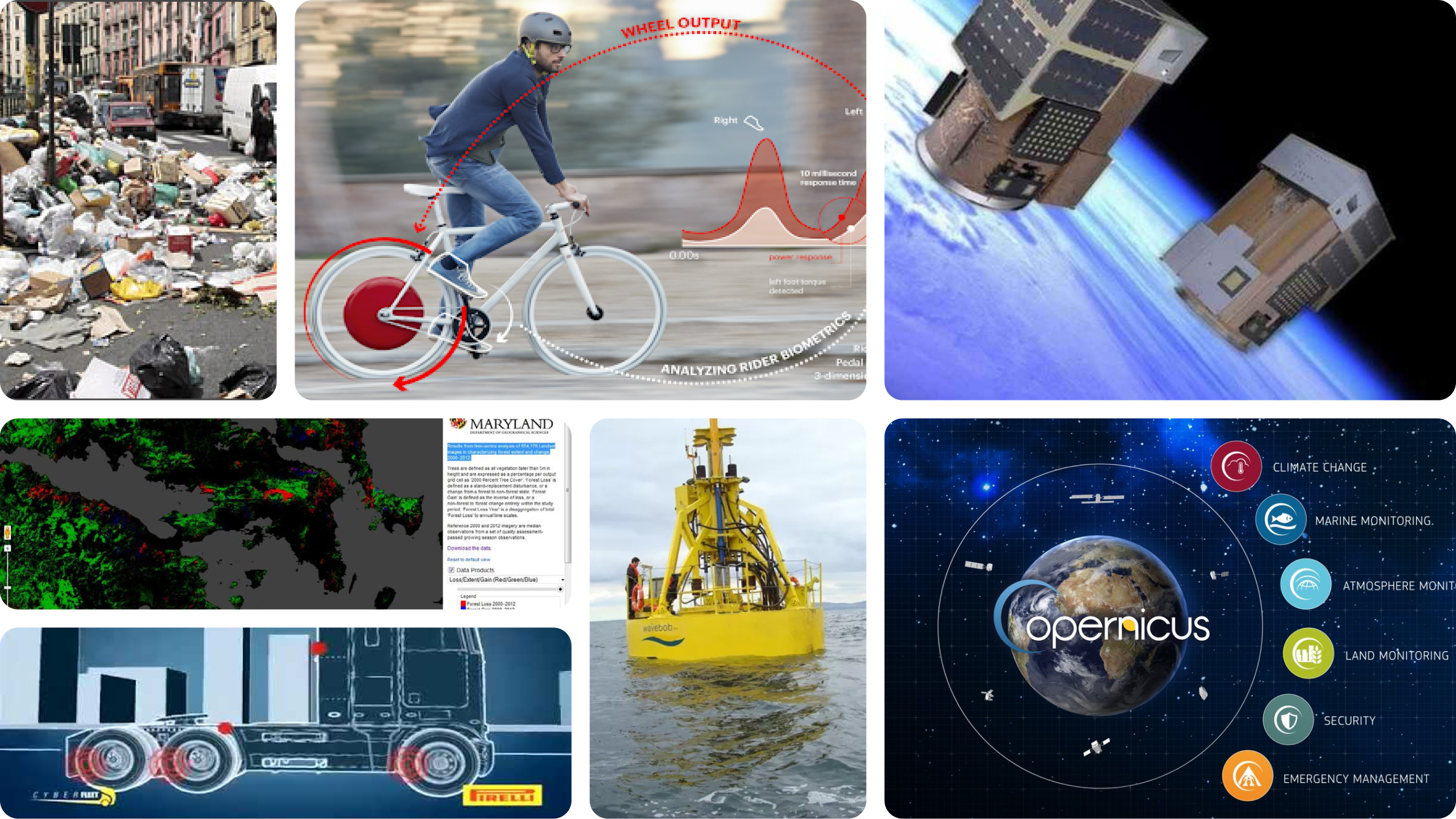
Environmental Data: Research shows the Earth’s ability to sustain human civilization is at risk. To understand the causes, several projects now track and analyze data.
A major share comes from urban areas—currently home to 55% of the world’s population, expected to reach 70% by 2050. Transportation and residential carbon footprints are the main contributors.
- Residential areas account for approximately 27–31% of global greenhouse gas emissions
- Utility prices rose by a 11%, making energy waste a primary driver of household inflation.
- Recent studies show 80% of families feel powerless over these rising costs because the data remains "invisible" until the bill arrives.
INSIGHTS & ACTIONS
According to my research, some of the insights and possible actions can be listed as:
Lack of Understanding
Insight: Because the data is invisible, Families have no understanding about their consumption until the bill arrives.
Action: Transition from reactive billing to real-time awareness.
Emotional Friction
Insight: Cold graphs and abstract metrics cause "data fatigue" and anxiety rather than motivation.
Action: Intuitive, low-stress, empathetic representation of data could be useful.
The Invisible Value
Insight: People are struggling to align with distant, serious environmental goals
Action: Short-term motivations, playfulness, nudging techniques could be more encouraging.
HMW give data a heartbeat?
STRATEGY
Responding to these insights requires a system-level strategy built on three fundamental pillars, rather than another standalone application.
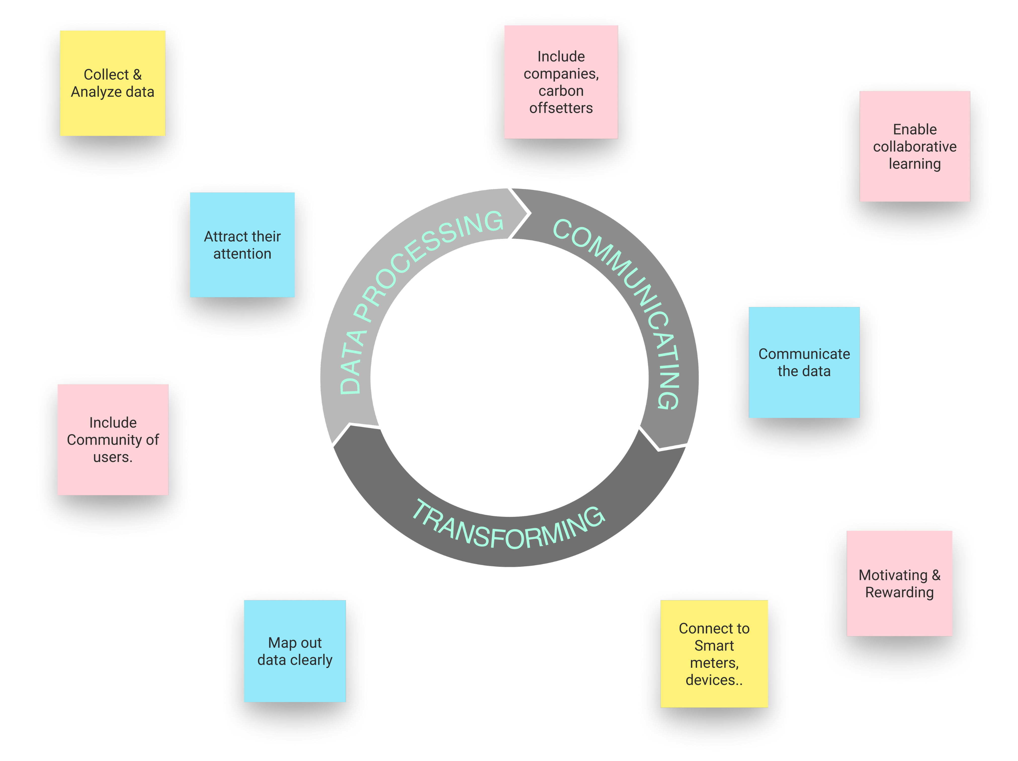
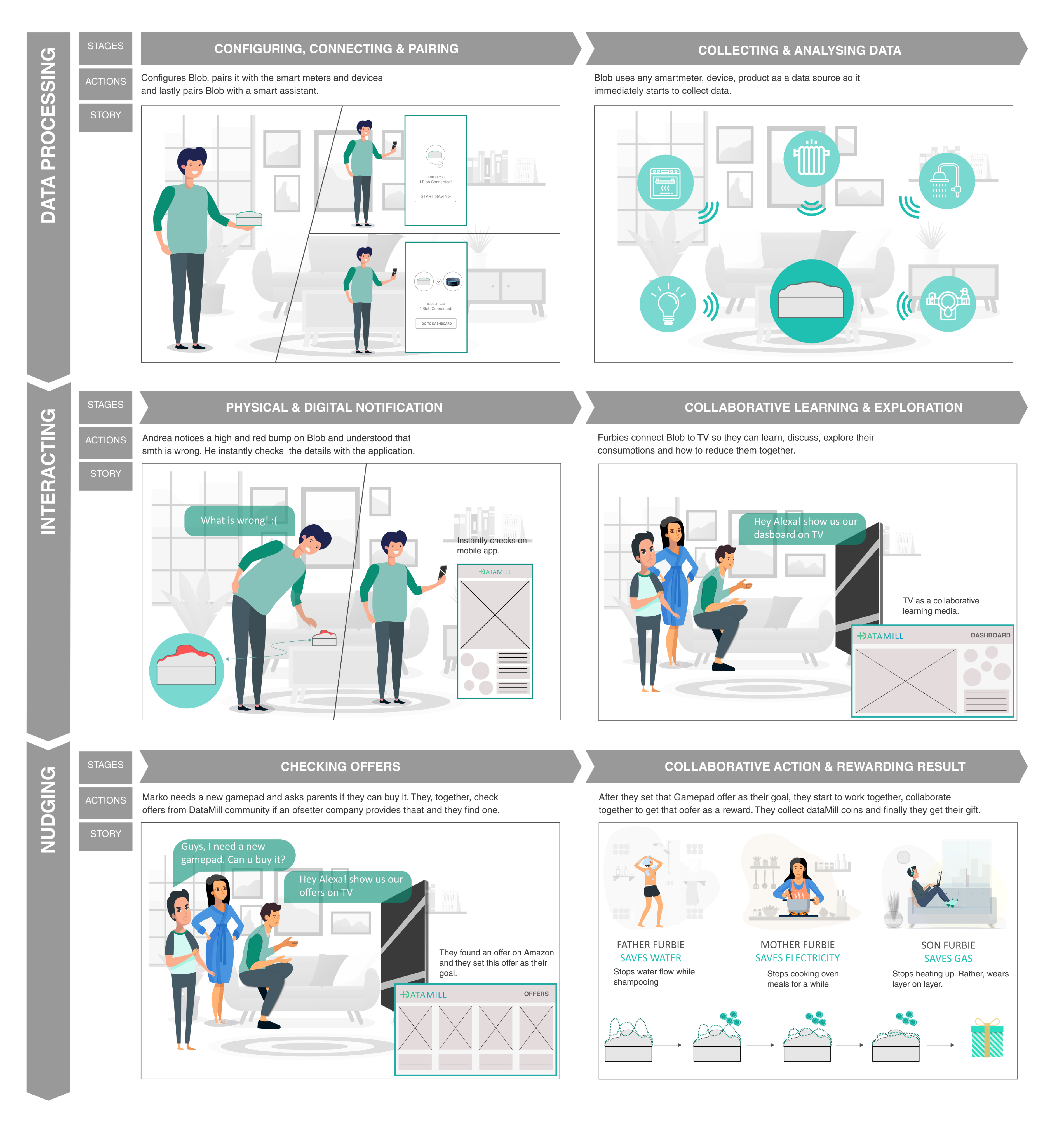
Data Processing: The system needs to track, intelligently process and deliver the data.
Communicating: The primary goal is to reduce Emotional friction and to actively build awareness through relatable feedback.
Transforming: The strategy is to encourage people to change toward sustainable individuals by replacing distant goals with motivational techniques.
''We cannot hope to create a sustainable culture with any but sustainable souls.''
Derrick Jensen - Endgame, Vol. 1: The Problem of Civilization
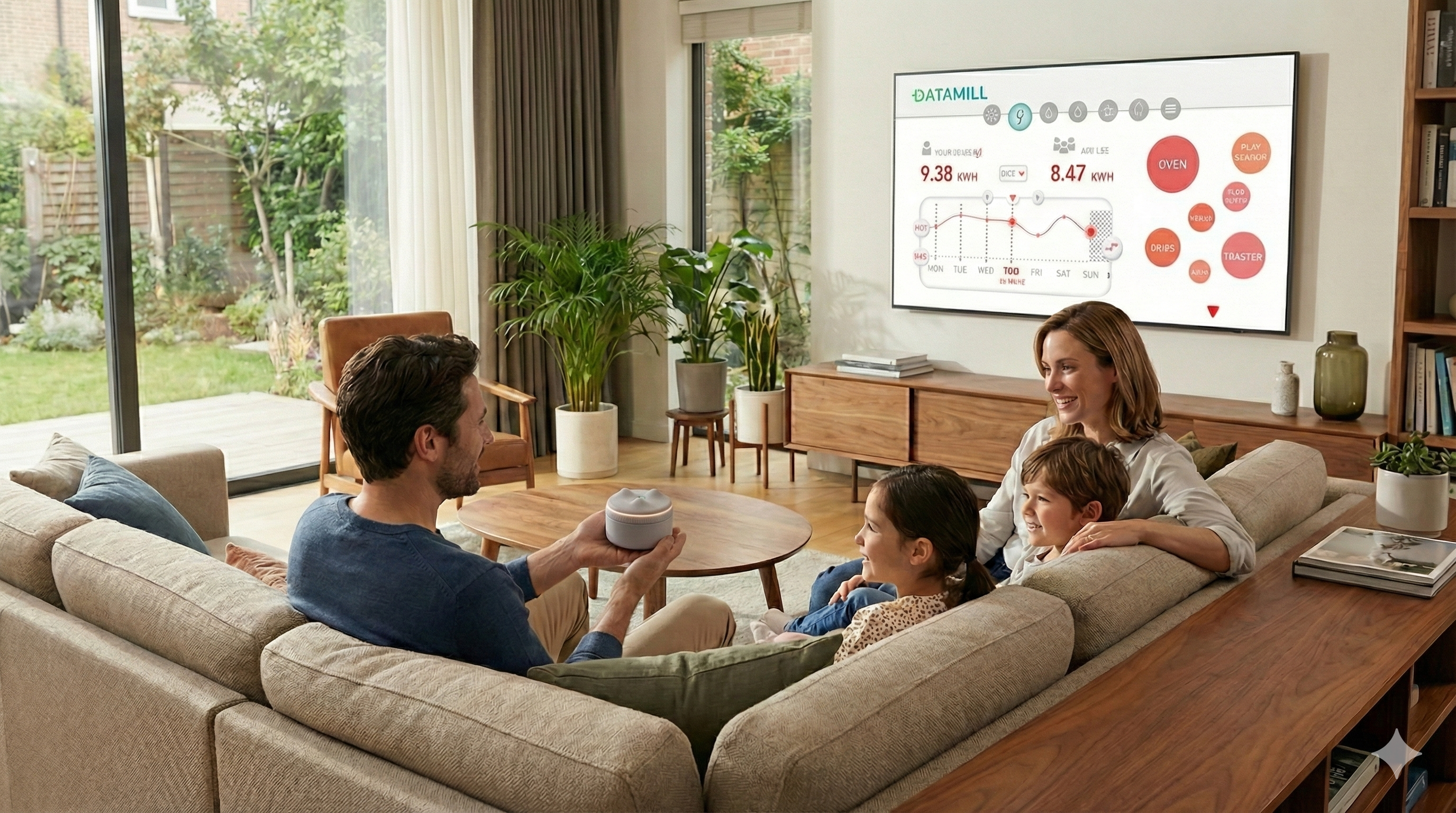
MEET DATAMILL
Following a solid Design process, DataMill came to life.
DataMill is a system designed to bridge the gap between abstract digital metrics and users. It transforms invisible household consumption into a tactile, tangible experience through a palm-sized companion called Blob, and an integrated Mobile and shared family UI.
DataMill uses nudging to replace distant sustainability goals with short-term, collaborative, intuitive, and rewarding experience that guides families toward more sustainable behavior.
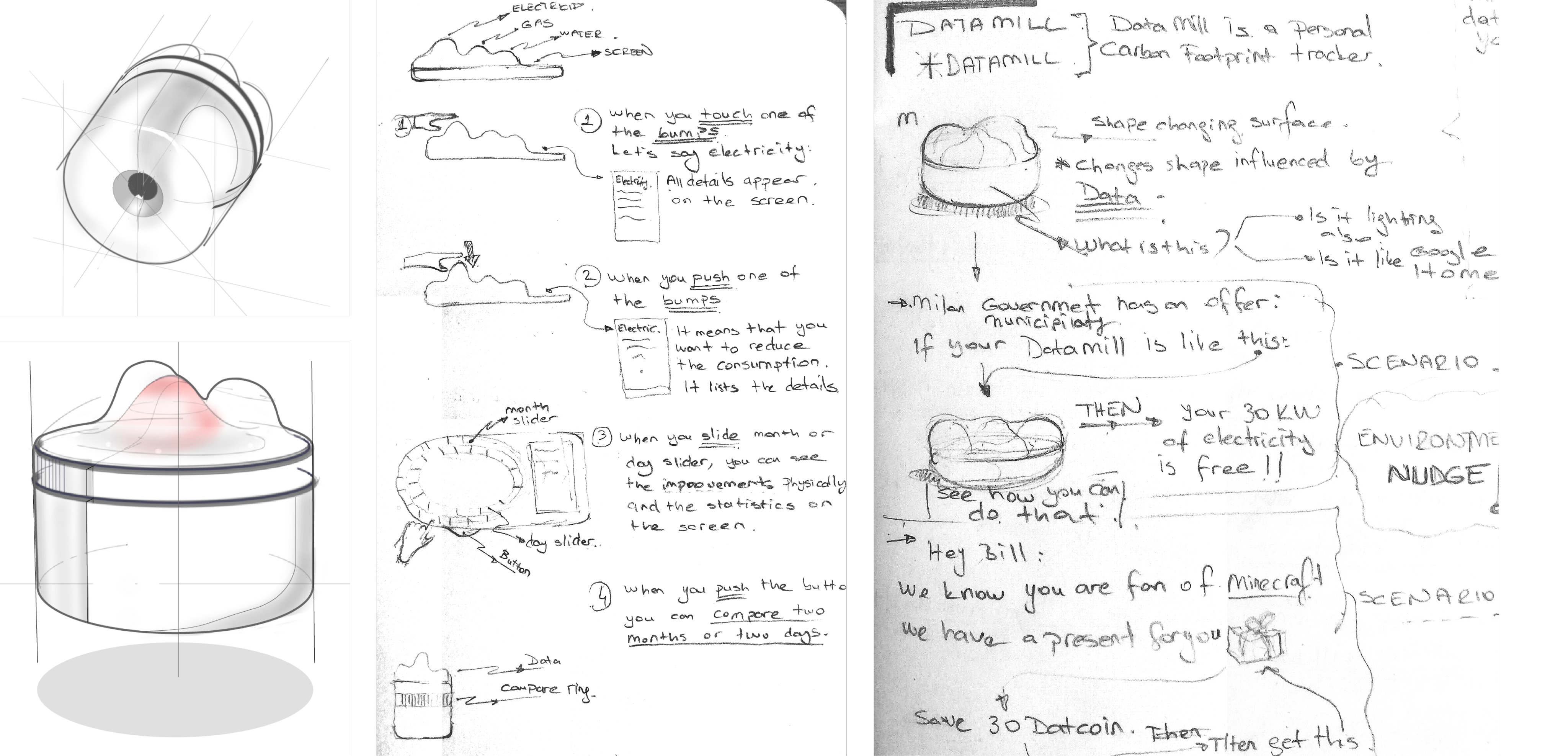
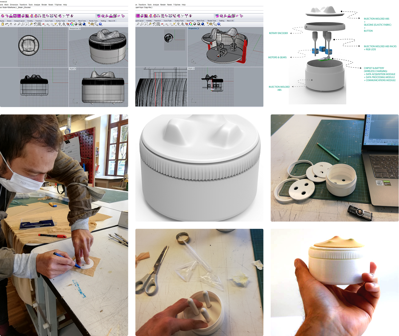
BLOB
Blob collects data and responds accordingly. While its future could be a standalone, sustainability-focused smart home assistant, in this project, it simply gathers data, reacts through shape and light changes, and syncs with a home assistant.
KEY FEATURES
1 - Shape & Light Notifications
Blob displays three data points and notifies users through shape and light changes. The bottom light shows the reward users have earned.
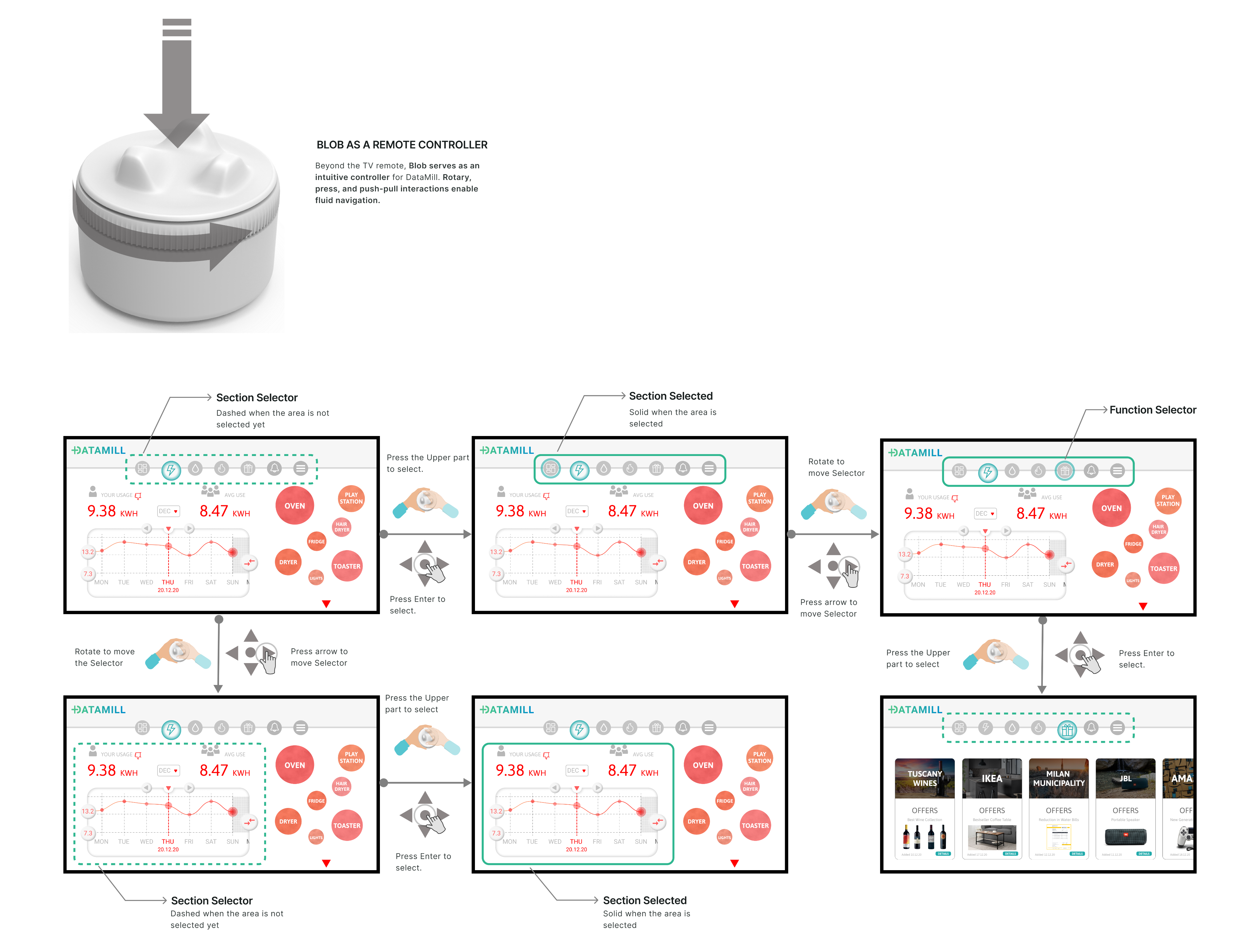
2 -Remote Controller
The TV app brings families together around shared insights and collective action. Blob serves as an Remote Controller with purpose-built interactions.
Raise Blob & Launch TV App.
Rotate the Rotary & Navigate
Press the Rotary & Select
3 - Customizable
Each of Blob’s three display areas is fully customizable, allowing them to tailor their experience.
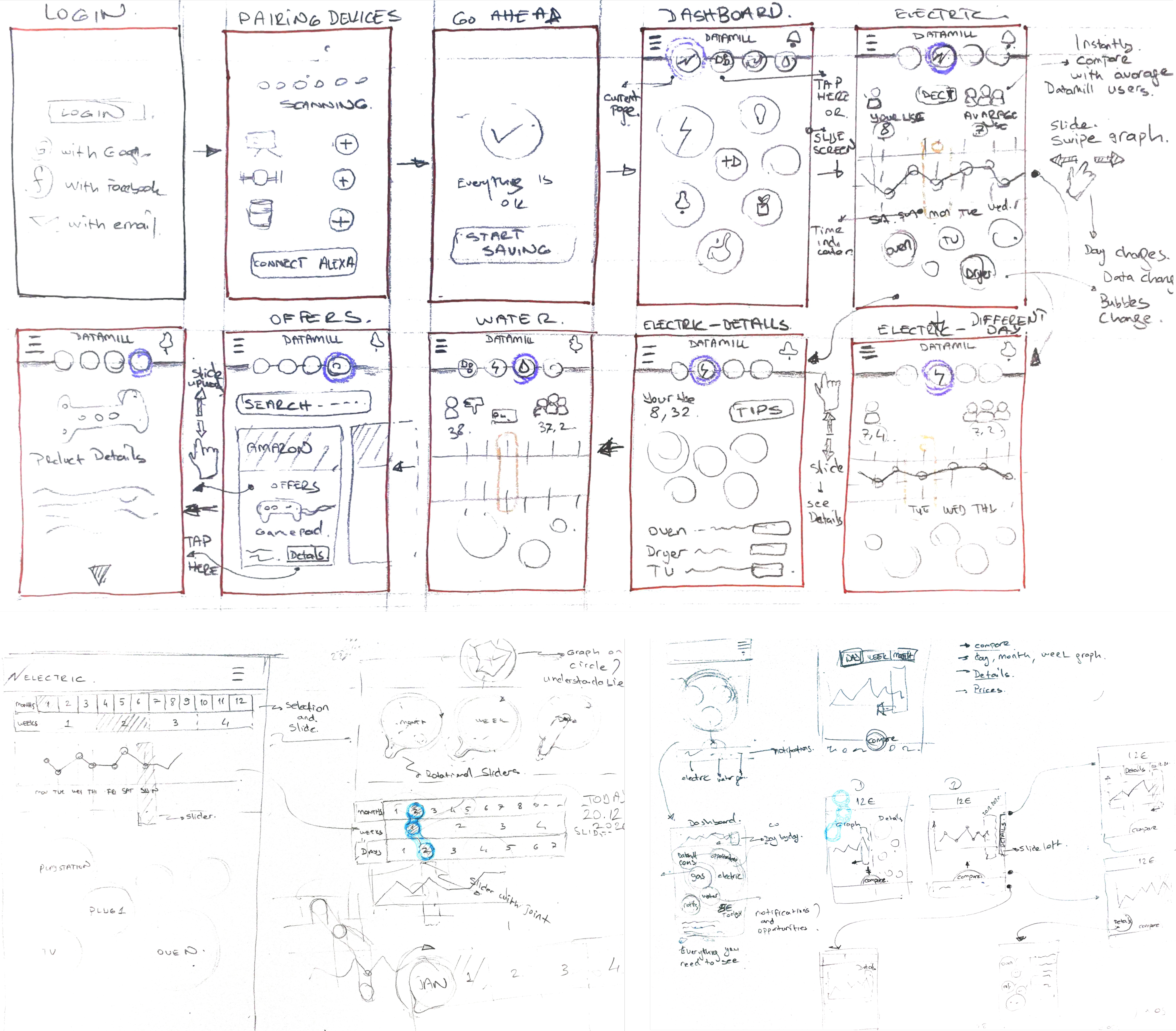
MOBILE APP
Mobile App is the center of DataMill system.
KEY FEATURES
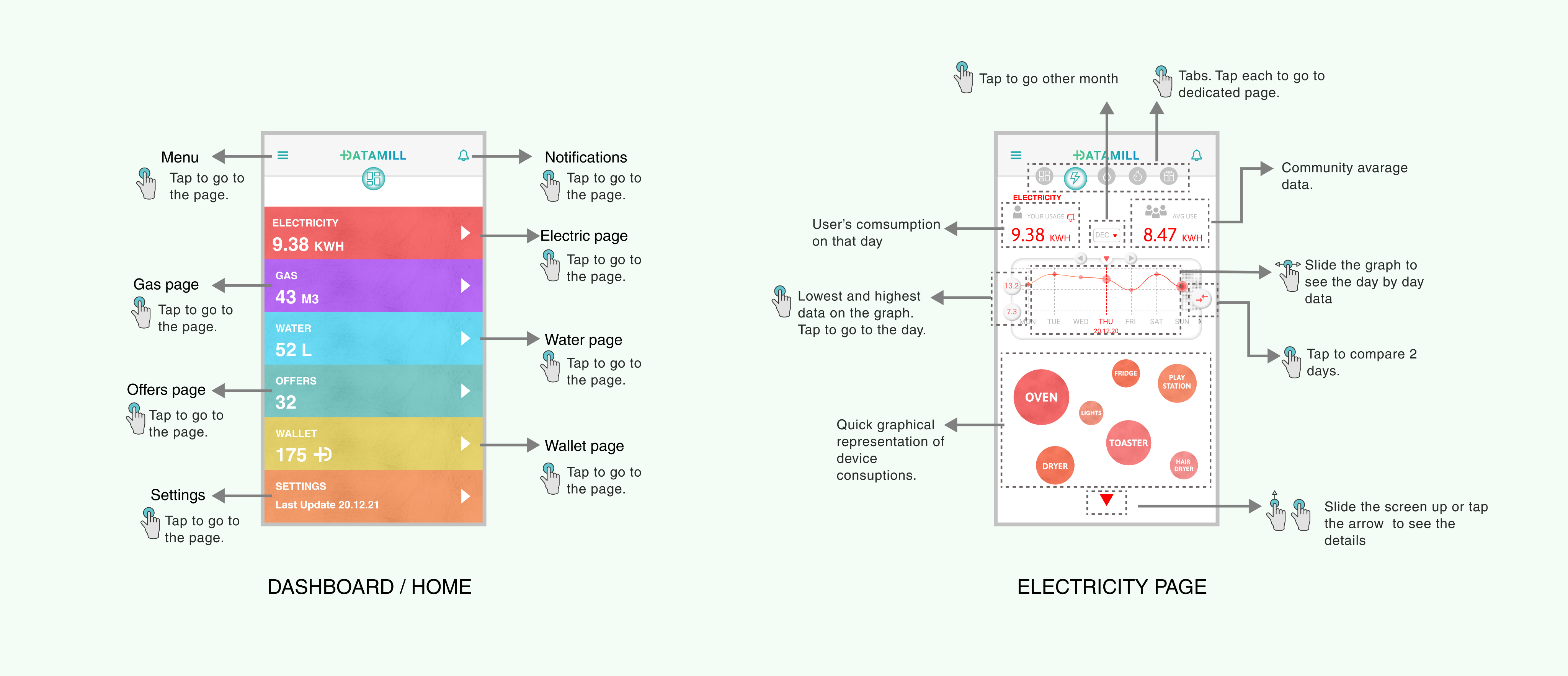
1 - Quick Overview
On the launch, user gets a quick overview without the need to navigate too much.
2 - Detailed Info
Users connect to all the information they need and they can customize their experience.
3 - Community Info
Community is one of the main features of the product. Aiming to enable users learn from each other.
4 - Least-Most / Time
Users can see the smallest and biggest comsumption of the month so they relate better in order to learn from it.
5 - Compare
Users can see the smallest and biggest comsumption of the month so they relate better in order to learn from it.
DESIGN PROCESS
SECONDARY RESEARCH
Building on primary research insights, I explored:
1 - How I can connect the data with the users in more engaging ways.
2 - How I can translate distant environmental goals into short-term, everyday awareness and trigger behavirol change.
Physicalization
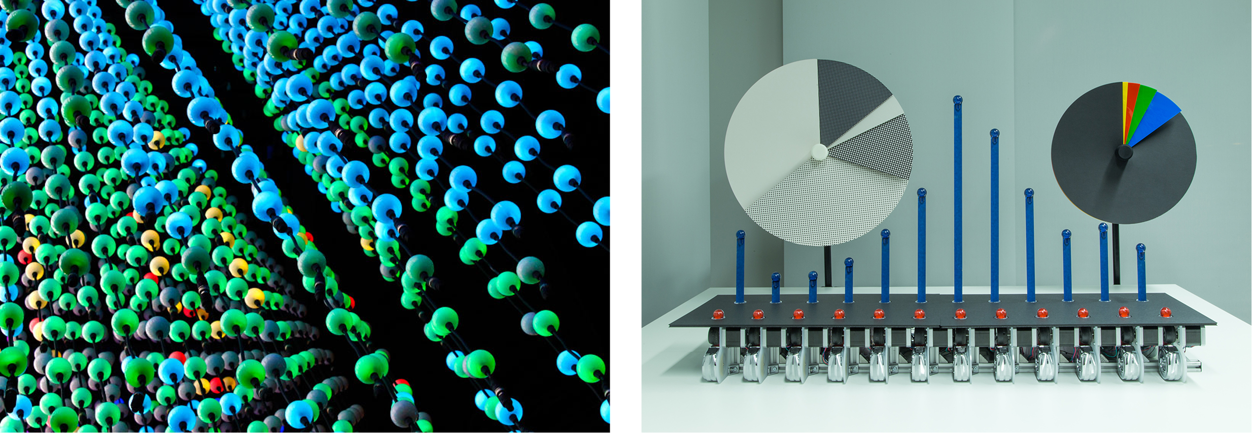
Data Physicalization started to be used for research purposes and has immense potential to impact the way data is perceived, analyzed, and communicated today.
Nudging

Nudging is a concept for helping people improve their thinking and decisions, managing change of all sorts, and identifying and modifying existing unhelpful influences on people.
PERSONA
THE FURBIE FAMILY
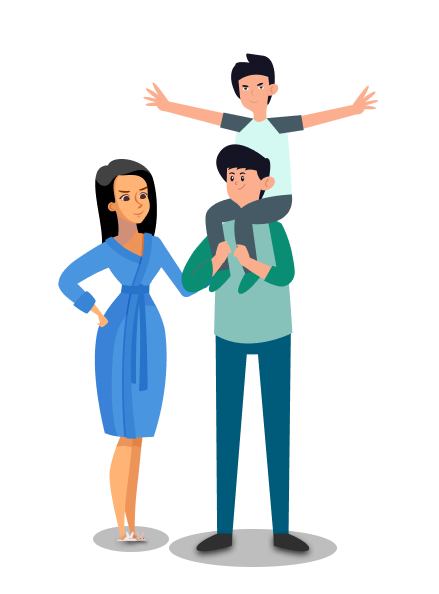
The Furbie Family is a middle-class household trying to do the right thing—financially and environmentally—but often feels unsure where to start.
They care deeply about their child’s future, and they need him to be involved in their efforts both financially and environmentally.
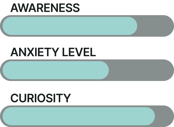
KEY NEED: Their energy consumption is largely invisible to them, making it hard to understand daily impact or change habits with confidence. Long-term sustainability goals feel distant; a rewarding, playful solution, especially for the kid, would motivate them better.
USER JOURNEY
In accordance with User Insights, Kid focus, healthy life style, smartness and seamless interaction are significant areas to cover in User Journey.
EXPLORATION
TOUCH POINTS
In accordance with User Journey, DataMill has three touchpoints. Data Tracker, Mobile UI and TV UI.
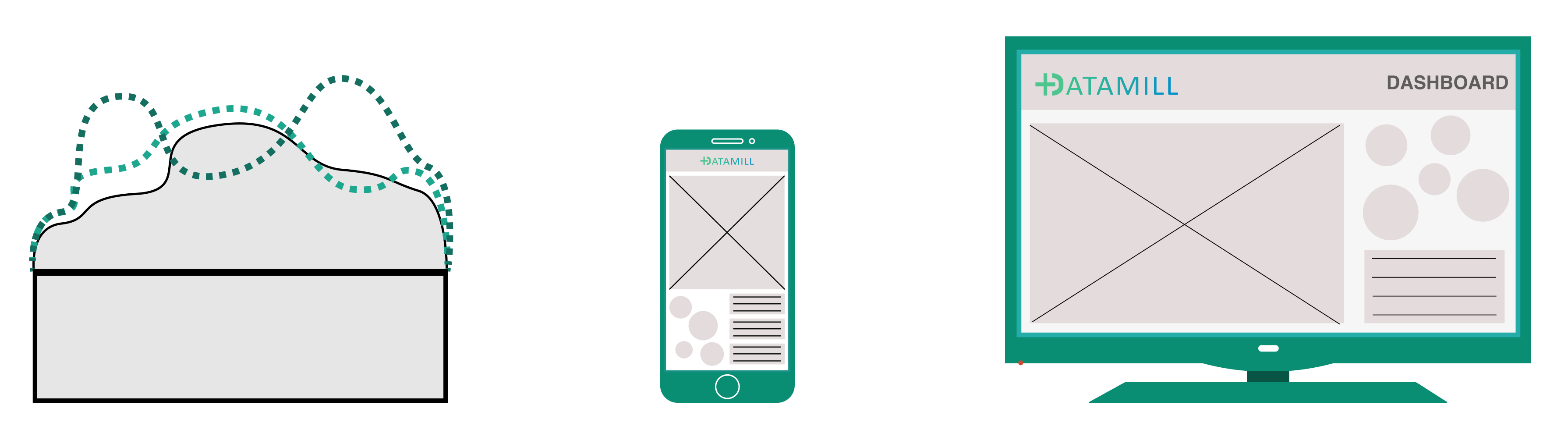
USER FLOWS
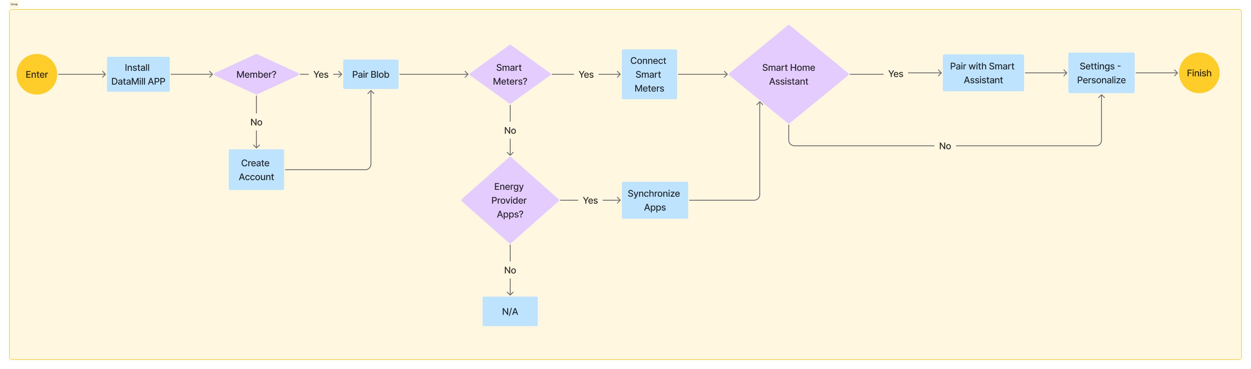
Setup
Interaction
Nudging
INTERACTION FLOWS
Setup
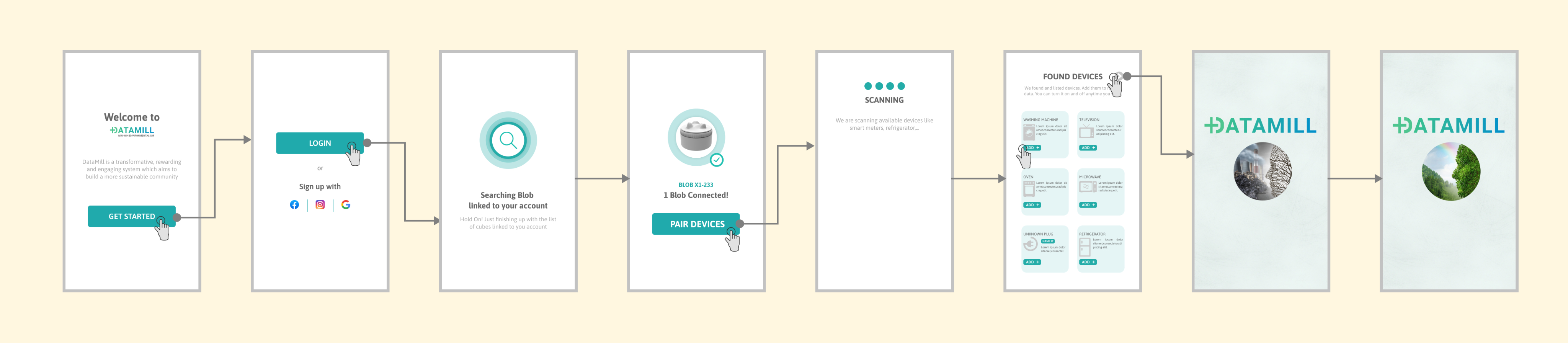
Page
Nudging
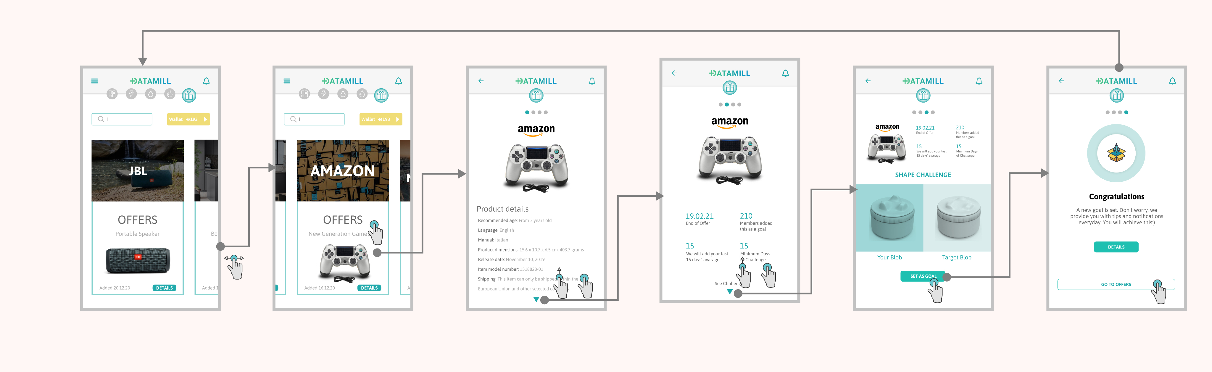
Blob & TV UI Interaction
LOW-FI PROTOTYPE
Let’s connect


Aycal Cagri Ozen
Works
DataMill
About
DATAMILL
Win-Win Environmentalism
DataMill is a system-level concept exploring how data can create visible value and drive sustainable behavior through multiple touchpoints.
THE SNAPSHOT
The Challenge:
Translating complex IoT environmental data into a meaningful, collaborative experience for families to reduce their residential carbon footprint.
The Solution:
A "data physicalization" ecosystem, called DataMill, centered around a smart tactile tracker ("Blob") that bridges the gap between digital metrics and physical awareness.
Key Deliverables:
Developed a cross-platform UI (Mobile/TV), a physical prototype, and a community-driven behavioral change strategy.
Outcome:
An engaging interaction model that transforms invisible household consumption into a tangible, shared journey toward sustainability.
BRIEF
The Internet of Things (IoT) is becoming a part of our daily lives but the challenge we face is to translate the possibilities presented by IOT and the data they generate. So, How could this information and these communication technologies be converted into real value for people?
RESEARCH
Big Data: Big Data has evolved from a technical asset into the primary engine for industrial decision-making, evaluation and preventive measures.
Environment & Sustainability, among others, has one of the biggest chunks of Big Data.
Environmental Data: Research shows the Earth’s ability to sustain human civilization is at risk. To understand the causes, several projects now track and analyze data.
A major share comes from urban areas—currently home to 55% of the world’s population, expected to reach 70% by 2050. Transportation and residential carbon footprints are the main contributors.
- Residential areas account for approximately 27–31% of global greenhouse gas emissions
- Utility prices rose by a 11%, making energy waste a primary driver of household inflation.
- Recent studies show 80% of families feel powerless over these rising costs because the data remains "invisible" until the bill arrives.
INSIGHTS & ACTIONS
According to my research, some of the insights and possible actions can be listed as:
Lack of Understanding
Insight: Because the data is invisible, Families have no understanding about their consumption until the bill arrives.
Action: Transition from reactive billing to real-time awareness.
Emotional Friction
Insight: Cold graphs and abstract metrics cause "data fatigue" and anxiety rather than motivation.
Action: Intuitive, low-stress, empathetic representation of data could be useful.
The Invisible Value
Insight: People are struggling to align with distant, serious environmental goals
Action: Short-term motivations, playfulness, nudging techniques could be more encouraging.
HMW give data a heartbeat?
STRATEGY
Responding to these insights requires a system-level strategy built on three fundamental pillars, rather than another standalone application.
Data Processing: The system needs to track, intelligently process and deliver the data.
Communicating: The primary goal is to reduce Emotional friction and to actively build awareness through relatable feedback.
Transforming: The strategy is to encourage people to change toward sustainable individuals by replacing distant goals with motivational techniques.
''We cannot hope to create a sustainable culture with any but sustainable souls.''
Derrick Jensen - Endgame, Vol. 1: The Problem of Civilization
MEET DATAMILL
Following a solid Design process, DataMill came to life.
DataMill is a system designed to bridge the gap between abstract digital metrics and users. It transforms invisible household consumption into a tactile, tangible experience through a palm-sized companion called Blob, and an integrated Mobile and shared family UI.
DataMill uses nudging to replace distant sustainability goals with short-term, collaborative, intuitive, and rewarding experience that guides families toward more sustainable behavior.
BLOB
Blob collects data and responds accordingly. While its future could be a standalone, sustainability-focused smart home assistant, in this project, it simply gathers data, reacts through shape and light changes, and syncs with a home assistant.
KEY FEATURES
1 - Shape & Light Notifications
Blob displays three data points and notifies users through shape and light changes. The bottom light shows the reward users have earned.
2 -Remote Controller
The TV app brings families together around shared insights and collective action. Blob serves as an Remote Controller with purpose-built interactions.
Raise Blob & Launch TV App.
Rotate the Rotary & Navigate
Press the Rotary & Select
3 - Customizable
Each of Blob’s three display areas is fully customizable, allowing them to tailor their experience.
MOBILE APP
Mobile App is the center of DataMill system.
KEY FEATURES
1 - Quick Overview
On the launch, Users gets a quick overview without the need to navigate too much.
2 - Detailed Info
Users connect to all the information they need and they can customize their experience.
3 - Community Info
Community is one of the main features of the product. Aiming to enable users learn from each other.
4 - Least-Most / Time
Users can see the smallest and biggest comsumption of the month so they relate better in order to learn from it.
5 - Compare
Users can see the smallest and biggest comsumption of the month so they relate better in order to learn from it.
DESIGN PROCESS
SECONDARY RESEARCH
Building on primary research insights, I explored:
1 - How I can connect the data with the users in more engaging ways.
2 - How I can translate distant environmental goals into short-term, everyday awareness and trigger behavirol change.
Physicalization
Data Physicalization started to be used for research purposes and has immense potential to impact the way data is perceived, analyzed, and communicated today.
Nudging
Nudging is a concept for helping people improve their thinking and decisions, managing change of all sorts, and identifying and modifying existing unhelpful influences on people.
PERSONA
THE FURBIE FAMILY
The Furbie Family is a middle-class household trying to do the right thing—financially and environmentally—but often feels unsure where to start.
They care deeply about their child’s future, and they need him to be involved in their efforts both financially and environmentally.
KEY NEED: Their energy consumption is largely invisible to them, making it hard to understand daily impact or change habits with confidence. Long-term sustainability goals feel distant; a rewarding, playful solution, especially for the kid, would motivate them better.
USER JOURNEY
In accordance with User Insights, Secondary Research, an ideal User Journey should be like this.
EXPLORATION
TOUCH POINTS
In accordance with User Journey, DataMill has three touchpoints. Data Tracker, Mobile UI and TV UI.
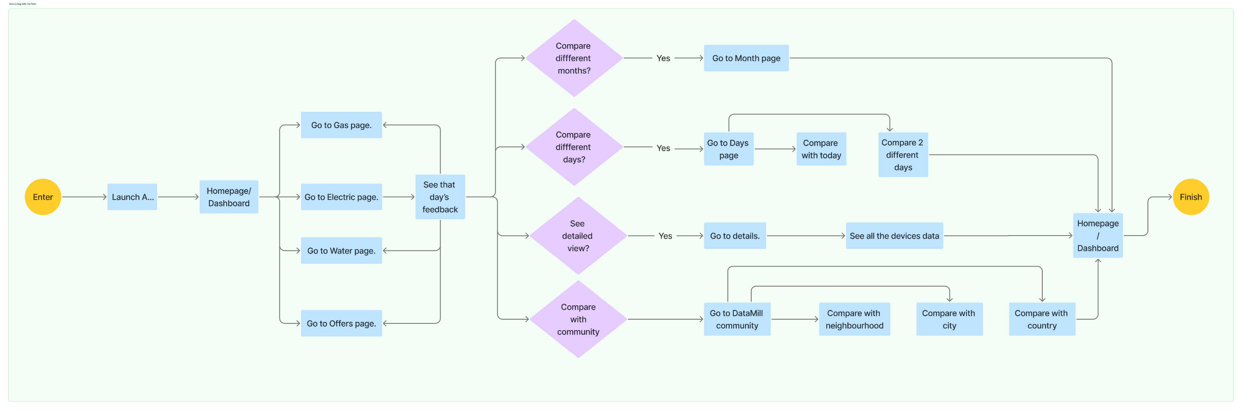
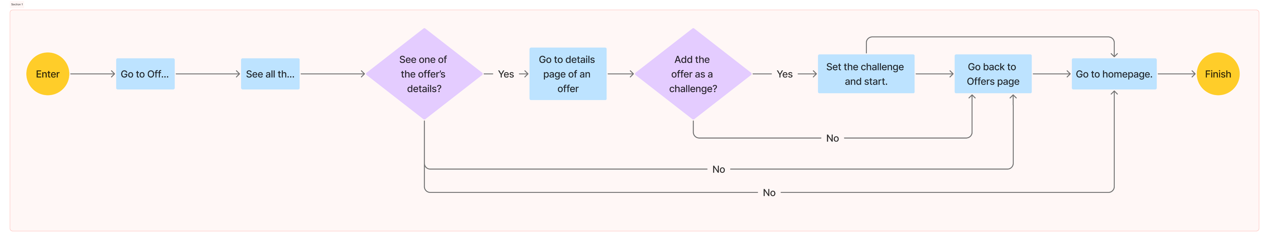
USER FLOWS
Setup
Interaction
Nudging
INTERACTION FLOWS
Setup
Page
Nudging
Blob & TV UI Interaction
LOW-FI PROTOTYPE
Aycal Cagri Ozen
Let’s connect
Works
DataMill
About
DATAMILL
Win-Win Environmentalism
DataMill is a system-level concept exploring how data can create visible value and drive sustainable behavior through multiple touchpoints.
THE SNAPSHOT
The Challenge:
Translating complex IoT environmental data into a meaningful, collaborative experience for families to reduce their residential carbon footprint.
The Solution:
A "data physicalization" ecosystem, called DataMill, centered around a smart tactile tracker ("Blob") that bridges the gap between digital metrics and physical awareness.
Key Deliverables:
Developed a cross-platform UI (Mobile/TV), a physical prototype, and a community-driven behavioral change strategy.
Outcome:
An engaging interaction model that transforms invisible household consumption into a tangible, shared journey toward sustainability.
BRIEF
The Internet of Things (IoT) is becoming a part of our daily lives but the challenge we face is to translate the possibilities presented by IOT and the data they generate. So, How could this information and these communication technologies be converted into real value for people?
RESEARCH
Big Data: Big Data has evolved from a technical asset into the primary engine for industrial decision-making, evaluation and preventive measures.
Environment & Sustainability, among others, has one of the biggest chunks of Big Data.
Environmental Data: Research shows the Earth’s ability to sustain human civilization is at risk. To understand the causes, several projects now track and analyze data.
A major share comes from urban areas—currently home to 55% of the world’s population, expected to reach 70% by 2050. Transportation and residential carbon footprints are the main contributors.
- Residential areas account for approximately 27–31% of global greenhouse gas emissions
- Utility prices rose by a 11%, making energy waste a primary driver of household inflation.
- Recent studies show 80% of families feel powerless over these rising costs because the data remains "invisible" until the bill arrives.
INSIGHTS & ACTIONS
According to my research, some of the insights and possible actions can be listed as:
Lack of Understanding
Insight: Because the data is invisible, Families have no understanding about their consumption until the bill arrives.
Action: Transition from reactive billing to real-time awareness.
Emotional Friction
Insight: Cold graphs and abstract metrics cause "data fatigue" and anxiety rather than motivation.
Action: Intuitive, low-stress, empathetic representation of data could be useful.
The Invisible Value
Insight: People are struggling to align with distant, serious environmental goals
Action: Short-term motivations, playfulness, nudging techniques could be more encouraging.
HMW touch the invisible and give data a heartbeat?
STRATEGY
Responding to these insights requires a system-level strategy built on three fundamental pillars, rather than another standalone application.
Data Processing: The system needs to track, intelligently process and deliver the data.
Communicating: The primary goal is to reduce Emotional friction and to actively build awareness through relatable feedback.
Transforming: The strategy is to encourage people to change toward sustainable individuals by replacing distant goals with motivational techniques.
''We cannot hope to create a sustainable culture with any but sustainable souls.''
Derrick Jensen - Endgame, Vol. 1: The Problem of Civilization
MEET DATAMILL
BLOB
Blob collects data and responds accordingly. While its future could be a standalone, sustainability-focused smart home assistant, in this project, it simply gathers data, reacts through shape and light changes, and syncs with a home assistant.
KEY FEATURES
1 - Shape & Light Notifications
Blob displays three data points and notifies users through shape and light changes. The bottom light shows the reward users have earned.
2 -Remote Controller
The TV app brings families together around shared insights and collective action. Blob serves as an Remote Controller with purpose-built interactions.
Raise Blob & Launch TV App.
Rotate the Rotary & Navigate
Press the Rotary & Select
3 - Customizable
Each of Blob’s three display areas is fully customizable, allowing them to tailor their experience.
MOBILE APP
Mobile App is the center of DataMill system.
KEY FEATURES
1 - Quick Overview
On the launch, user gets a quick overview without the need to navigate too much.
2 - Detailed Info
Users connect to all the information they need and they can customize their experience.
3 - Community Info
Community is one of the main features of the product. Aiming to enable users learn from each other.
4 - Least-Most / Time
Users can see the smallest and biggest comsumption of the month so they relate better in order to learn from it.
5 - Compare
Users can compare two days for example the least and the most so they can see what matters in order to reduce their consumptions.
DESIGN PROCESS
SECONDARY RESEARCH
Building on primary research insights, I explored:
1 - How I can connect the data with the users in more engaging ways.
2 - How I can translate distant environmental goals into short-term, everyday awareness and trigger behavioral change.
Physicalization
Data Physicalization started to be used for research purposes and has immense potential to impact the way data is perceived, analyzed, and communicated today.
Nudging
Nudging is a concept for helping people improve their thinking and decisions, managing change of all sorts, and identifying and modifying existing unhelpful influences on people.
PERSONA
THE FURBIE FAMILY
The Furbie Family is a middle-class household trying to do the right thing—financially and environmentally—but often feels unsure where to start.
They care deeply about their child’s future, and they need him to be involved in their efforts both financially and environmentally.
KEY NEED: Their energy consumption is largely invisible to them, making it hard to understand daily impact or change habits with confidence. Long-term sustainability goals feel distant; a rewarding, playful solution, especially for the kid, would motivate them better.
USER JOURNEY
In accordance with User Insights, Kid focus, healthy life style, smartness and seamless interaction are significant areas to cover in User Journey.
TOUCH POINTS
In accordance with User Journey, DataMill has three touchpoints. Data Tracker, Mobile UI and TV UI.
EXPLORATION
USER FLOWS
Setup
Interaction
Nudging
INTERACTION FLOWS
Setup
Page
Nudging
Blob & TV UI Interaction
LOW-FI PROTOTYPE
Aycal Cagri Ozen
Let’s connect